Apple doesn’t often backpedal on design decisions, but when millions of iPhone users complained about eye strain and readability issues after iOS 26 dropped its bold Liquid Glass overhaul, the company actually listened. iOS 27 arrives with a dedicated transparency slider that finally puts you in control of how glassy your interface looks. Whether you loved the effect from day one or found it exhausting to look at, this is the setting you’ve been waiting for.
Here’s everything you need to know to find it, use it, and get the most out of it.
What Is Liquid Glass (And Why Does Transparency Matter)?
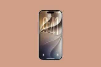
Liquid Glass is Apple’s signature design language, first introduced in iOS 26 and significantly refined in iOS 27. It wraps UI elements like app icons, toolbars, notifications, Control Center, and menus in a translucent, light-refracting, almost physical-looking material. Think less “frosted glass” and more “actual glass sitting on top of your wallpaper,” shifting subtly as your content moves underneath.
The problem is that the effect is heavily dependent on how transparent those layers actually are. Set it too clear, and text becomes hard to parse against a busy wallpaper. Set it too opaque, and you lose the whole point of the design. iOS 26 gave you a binary choice: Clear or Tinted, with nothing in between. iOS 27 fixes that.
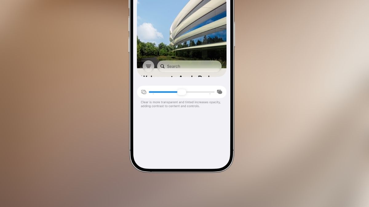
What’s New: The Liquid Glass Transparency Slider in iOS 27
The headline addition for Liquid Glass transparency in iOS 27 is a brand-new granular slider that replaces the old two-option toggle. It’s a direct response to feedback Apple received throughout iOS 26’s lifecycle, and it makes a real difference in day-to-day usability.
The slider gives you a full spectrum between two extremes:
- Ultra-Clear (slider left): Maximum transparency. Glass layers become highly see-through, your wallpaper shows through more strongly, and the liquid refraction effect is most pronounced.
- Fully Tinted (slider right): More frosted and opaque, with significantly better contrast for text and interface elements. It’s also easier on the eyes in bright environments.
Every position between those two ends is valid. You’re not locked into presets. That’s the upgrade.
Things to Know Before You Start
Before diving in, a few important caveats:
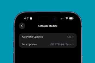
- iOS 27 beta is required. This slider doesn’t exist in iOS 26. You need to be enrolled in the iOS 27 beta program.
- Supported devices: iPhone 11 and newer. Older hardware won’t see this option even if running iOS 27.
- It’s still beta software. Occasional glitches are part of the deal right now. The public beta is expected in July 2026, with the full release coming in fall 2026.
- No restart needed. Changes apply instantly, system-wide. Just move the slider and watch your interface update in real time.
How to Use the New Slider to Adjust the Liquid Glass Transparency Effect in iOS 27
Once you’re running the iOS 27 beta, the setting is straightforward to find:
- Open the Settings app and navigate to Appearance (some beta builds may show this under Display & Brightness, so check both if you don’t see it immediately).
- Scroll down and tap Liquid Glass.
- Use the transparency slider to find your sweet spot:
- Drag left toward Ultra-Clear for a more glassy, fluid, and transparent interface.
- Drag right toward Fully Tinted for more density, better contrast, and reduced visual noise.
- Exit Settings. Your preference saves automatically with no confirmation or restart required.
Why You Might Actually Want to Tweak This
This isn’t just a cosmetic preference toggle. There are genuinely practical reasons to spend a few minutes dialing it in.
If you get headaches or eye strain from iOS 26’s default look, pulling the slider toward Tinted can immediately reduce the visual complexity your brain has to process, especially on busy wallpapers.
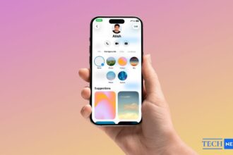
If you’re a Liquid Glass maximalist who wants the full aesthetic effect, pushing toward Ultra-Clear and pairing it with a high-contrast dark or vibrant wallpaper gives you the most dramatic, immersive result. Speaking of which, the effect really does look stunning with the right background. Liquid Glass wallpapers are specifically designed to complement the transparency layers, and the difference versus a random photo is genuinely noticeable.
If you want a hybrid approach, combine a mid-range transparency setting with Accessibility → Reduce Transparency turned on. It sounds counterintuitive, but the combination creates a muted-glass aesthetic that many people find easier to read while still feeling modern.
Still on iOS 26? Here’s Your Workaround
If you haven’t jumped to the iOS 27 beta yet, you’re not completely without options. In iOS 26, go to Settings → Display & Brightness → Liquid Glass and switch between Clear and Tinted. It’s a binary toggle rather than a slider, but it covers the two extremes.
Alternatively, head to Settings → Accessibility → Display & Text Size → Reduce Transparency. This will flatten most of the glass effects entirely, trading aesthetics for readability.
Neither option gives you the nuance of the iOS 27 slider, but they’re functional stopgaps until the full release arrives this fall.